Freezing out the facts
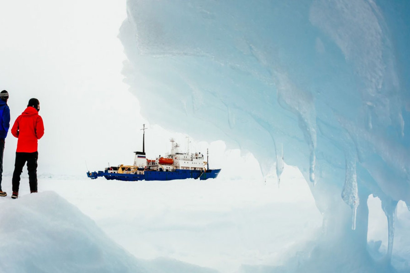
Passenger Andrew Peacock took this photo of the ship MV Akademik Shokalskiy stuck in the ice off East Antarctica.
As the saying goes, a picture is worth a thousand words, and by now you might have seen dramatic images of passengers on stranded icebreaker Akademik Shokalskiy being rescued by helicopter last Friday after becoming lodged in Antarctica sea ice on Christmas Eve.
Another type of picture – the graph – plays a major role in science.
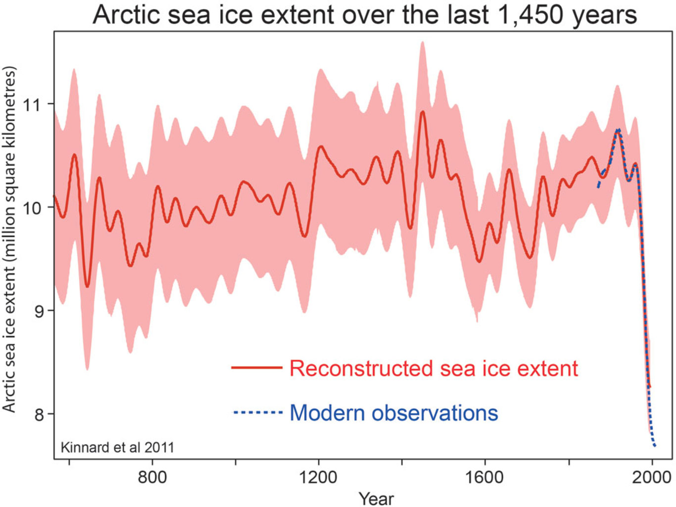
No one could look at the graph below, which shows the extent of arctic ice during the past 1,450 years, without realising that the polar ice cap has been melting at a rapid and wholly unprecedented rate over the past few decades.
Similarly, my own research has shown that if people are shown a graph with global temperatures during the past few decades, they invariably understand and predict that further warming is in store – this is true even for the few people (less than 10% in my sample) who denied that climate change is taking place.
Graphs and pictures are powerful scientific analysis and communication tools.
The power of graphs and pictures, and the anecdotes they can evoke, are also powerful means by which people can be misled, inadvertently or otherwise.
Skeptical Science
It is well known that the national newspaper, The Australian, has a track record of distortion and misrepresentation when it comes to climate reporting, so it is informative to examine what role pictures, or the anecdotes they evoke, often play in their reporting.
The recent adventures of the Australian expedition to Antarctica are a case in point. Under the headline Stuck on a ship of (cold) fools, the newspaper opined:
You have to feel a touch of sympathy for the global warming scientists, journalists and other hangers-on aboard the Russian ship stuck in impenetrable ice in Antarctica, the mission they so confidently embarked on to establish solid evidence of melting ice caps resulting from climate change embarrassingly abandoned because the ice is, in fact, so impossibly thick.
The aim of the Australasian Antarctic Expedition, led by Chris Turney of the University of NSW, was to prove the East Antarctic ice sheet is melting. Its website spoke alarmingly of “an increasing body of evidence” showing “melting and collapse from ocean warming”.
Instead, rescue ships and a helicopter, all belching substantial carbon emissions, have had to be mobilised to pluck those aboard the icebreaker MV Akademik Schokalskiy from their plight, stuck in what appears to be, ironically, record amounts of ice for this time of year.
An ice breaker gets stuck in ice – we’ve all seen the pictures – and somehow this is an embarrassment to “global warming scientists”.
Actually, no.
If one goes to the expedition’s website, their first three scientific goals (there are nine altogether) are as follows:
- gain new insights into the circulation of the Southern Ocean and its impact on the global carbon cycle
- explore changes in ocean circulation caused by the growth of extensive fast ice and its impact on life in Commonwealth Bay
- use the subantarctic islands as thermometers of climatic change by using trees, peats and lakes to explore the past.
I have highlighted the important bit: the growth of extensive fast ice. So what is “extensive fast ice”? It is a form of sea ice, and it is obviously sea ice in which the expedition is now stuck.
In other words, the expedition is experiencing the very conditions it set out to study — namely the various kinds of sea ice that scientists know are increasing around Antarctica, while the icecaps on Antarctica are known to melt.
How much is Antarctica melting? The graph below shows us.
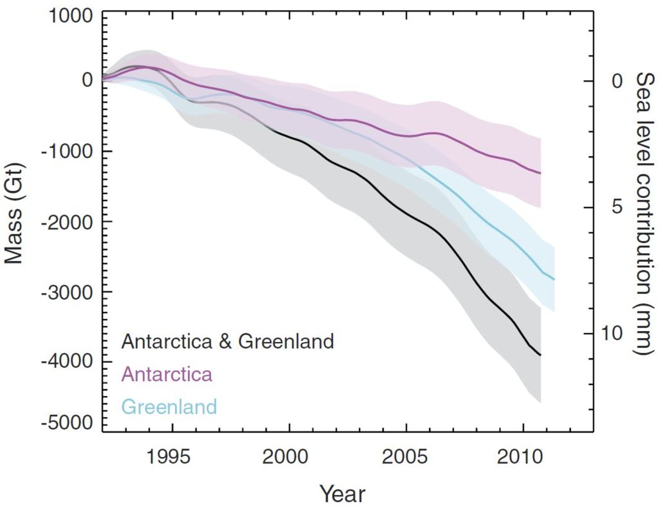
Shepherd A et al (2012). ‘A Reconciled Estimate of Ice-Sheet Mass Balance.’ Science, 338 6111:1183-9
There is a solid body of evidence that Antarctica is melting (a consequence of global warming) whereas sea ice around Antarctica is increasing. The reasons underlying those seemingly opposing trends make for some fascinating science.
A fascination with science, alas, is not always apparent in the pages of The Australian.
Their idolatry of pictures, on the other hand, cannot be overlooked.
If it is not icebreakers, then it is a picture of a bronzed Aussie swimmer in his budgie smugglers under the headline Wong wipeout doesn’t wash with locals. This heroic 53-year-old had been swimming at Bondi beach for 30 years and “was adamant he had seen ‘no change’ to the coastline”, thereby presumably putting yet another final nail (approximately the 156th) into the coffin of global warming and sea level rise.
A great picture, perhaps, and Bondi’s swimmers are entitled to their opinions. The actual data, meanwhile, paint another picture about global sea level rise: a steady increase in mean sea level over the past two decades.

Nerem R S et al (2010). ‘Estimating Mean Sea Level Change from the TOPEX and Jason Altimeter Missions.’ Marine Geodesy 33, no. 1 supp 1: 435.
Pictures are powerful.
Pictures are worth more than a thousand words.
Pictures and graphs can inform when they present scientific data. But equally, pictures can mislead when they evoke irrelevant anecdotes instead of the reality that is described by scientific data.
Stephan Lewandowsky is Chair of Cognitive Psychology at the University of Bristol.
This article was first published at The Conversation.