Keep it simple, stupid: towards cleaner wine label design
Philip White thinks there’s a welcome move back to honesty and simplicity in the designs and texts some winemakers are wrapping around their bottles.

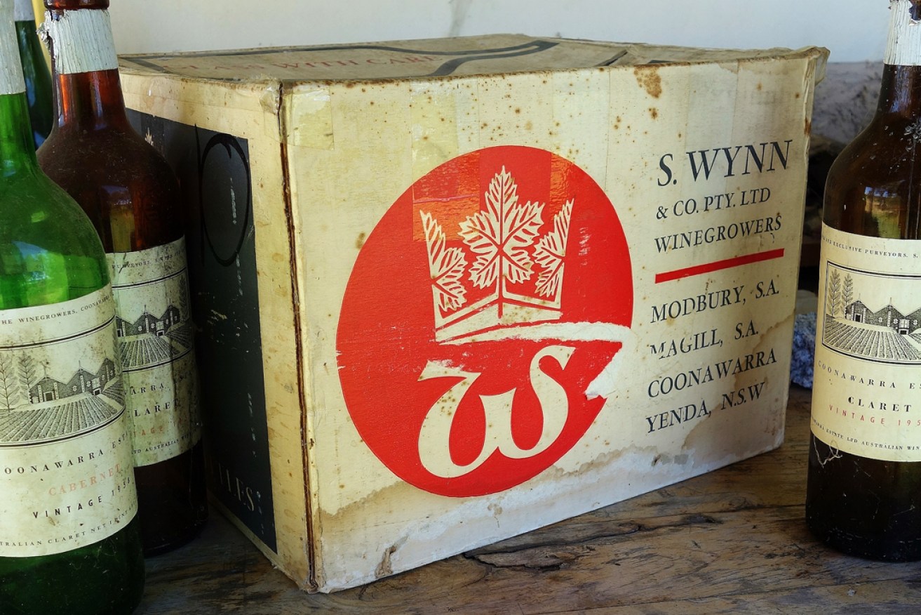
The label design of Wynns Coonawarra Estate bottles has remained constant. Photo: Philip White
Awoken last night by my mates Valmai Hankel, the great librarian, historian, desert traveller, writer and book expert, and her carer, the illustrator George Grainger Aldridge, talking wine literature to ABC Adelaide announcer Peter Goers, I’m sure I heard the latter complain that he thought my reference once to a wine smelling like lignite was pushing my descriptors too far.
This usage seems to have annoyed dear Goers for years.
Grape skins, from whence the winemaker takes colour and flavour, are composed largely of lignin. The oak of barrels is made from lignin – it’s the scaffolding that holds plants up.
Toast the barrels toward the point that Bourbon makers call “gatorback” and you oxidise that lignin. Add a dash of the yeast brettanomyces, which lives on sugar in the wood, leaving mainly oxidised lignin aromas, and you shouldn’t be surprised if the eventual drink smells a bit like lignite, which is brown coal, which is oxidised lignin, no?
As a little kid growing up in the mountains overlooking the La Trobe Valley, I learned very young that aroma of the coal trains scurrying along the valley floor, carting coal and briquettes from Yallourn to Melbourne. It seemed an opposite aroma to the freshness and bountiful growth of rainy Gippsland.
While this slight whinge about usage came amid some very kind praise, thank you, it reminded me of the current state of wine labels and the mess of mangled grammar that finds its way onto many back labels. I wouldn’t expect notable levels of English descriptive literacy from a winemaker any more than I’d expect it of an accomplished potato farmer or lab chemist, but jeez, some of it leaves a fair bit to be desired.
I suppose it adds something folksy to the product, but they forget that what I want is copy in a face large enough to read, in colours chosen to assist the large number of folks who, like me, have rather challenging colour-blindness. I want to be able to easily see the alcohol level, in the hope the winemaker hasn’t taken too much advantage of the slack law that permits 1.5 per cent variation in the ethanol degree – either side of the claimed amount.
This means many wines that claim the standard 14.5 per cent level are actually closer to 16 per cent, a degree that puts your table wine closer to the realms of port strength than the polite amount you might expect to enjoy with your chook. Not that I haven’t enjoyed too many wines that were perhaps a bit too strong for me.
Now I see a return to some more classical labelling on front labels. We’ve had a few years where the shelves bulged with a great cacophonic mess of label art, amateurish, confusing and confounding. We got past that phase where Mum and Dad would sit down at the table with a biro and pad and design a label, and got to the point where it was young Pebble Brook and Fern Raintree, the kids, designing imagery that ranged from head comix and Mouse Studios’ Grateful Dead posters in style, to rather infantile drawings of fairies and glitter.
Often this matches the mood of the murky, naturally oxidising tinctures within; just as frequently it serves as a warning to this prospective buyer.
To avoid this confusion, it seems there is a return to providing some basic essential information about strength, grape type, source and age. This is good!
One of my mentors was that erudite wine man and art collector David Wynn, who wanted to be an architect or a sculptor more than a winemaker, even after his old dad, Sam, convinced him instead to follow the winemaking game upon his demobbing from the Air Force.
David was exceptional in the degree of fuss he put into his label design. Foremost is the example that survives to this day on Wynns Coonawarra Estate bottles. After I congratulated him on never changing it, and keeping it constant, he chuckled and showed me how, over the years, he’d made constant, almost imperceptible micro adjustments to his design, which was based around Richard Beck’s perfectly simple woodcut of John Riddoch’s 1890s winery and distillery.
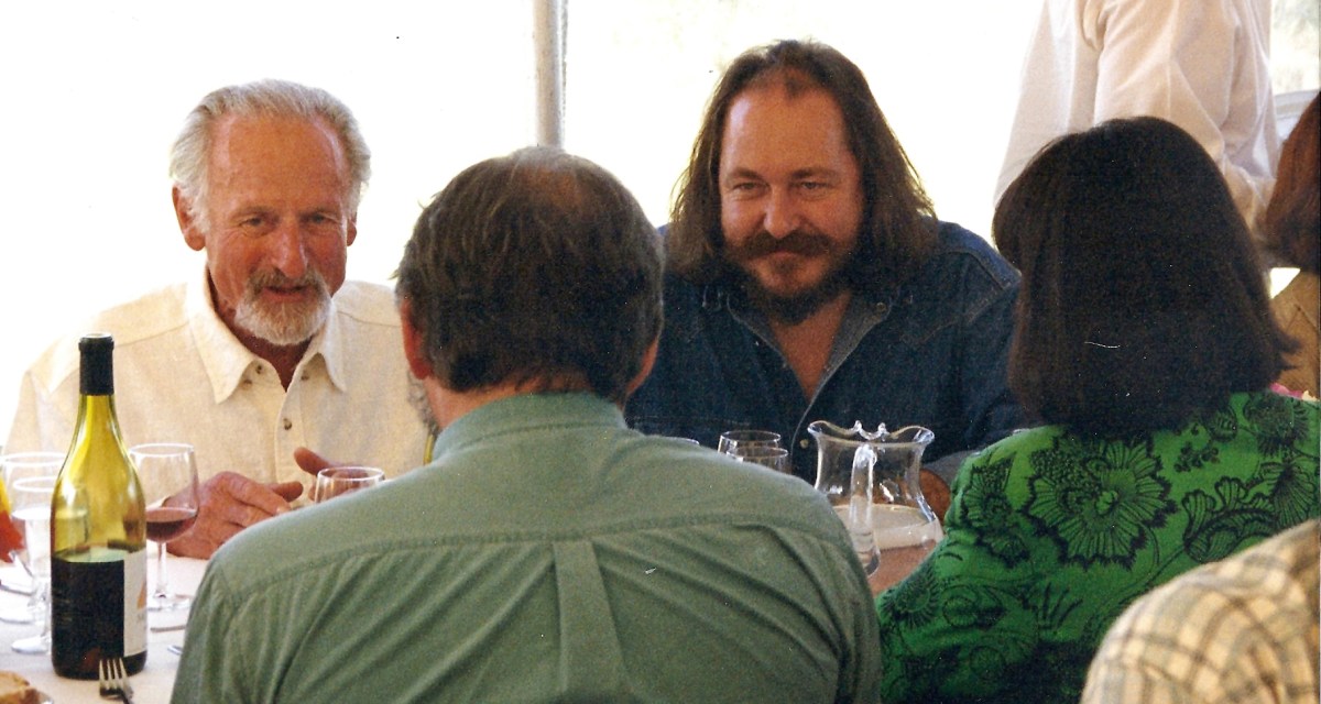
David Wynn, Philip White, Howard Twelftree and Tomono Wynn in 2004.
David had commissioned Beck very early in the piece: it bravely announced a new direction for the region, and in the 50s, was alarming in its modernity. David claimed to be the first winemaker to use the word “Estate” in relation to his holding, and while he left Beck’s distinctive illo unchanged, he struggled and fiddled each vintage to ensure the words “Wynn’s Coonawarra Estate” and “Coonawarra” appeared as many times as possible on his bottle.
It was on the capsule (twice); it was on the cork. It was on the front label, prominently, and repeated in finer print at the bottom as the estate address. Turn the bottle around, there was a map showing Coonawarra, with, yep, Wynn’s Coonawarra Estate smack dab in the middle. It was repeated there again, in fine face, top and bottom; even in four point, up the side, as a code. Just to be sure.
“If you’re on Norwood Parade,” Wynn told me, “and there’s a bottle of my wine on a table on the other side of the road, I want you to recognise that bottle as Wynn’s.
“If you walk into a liquor barn, and there’s a bottle of my wine on the shelf right down the back, I want you to recognise that bottle, walk straight to it, pick it up and buy it with confidence and pride. Between the shelf and the till, I want you to read ‘Wynn’s’ and ‘Coonawarra Estate’ as many times as possible.”
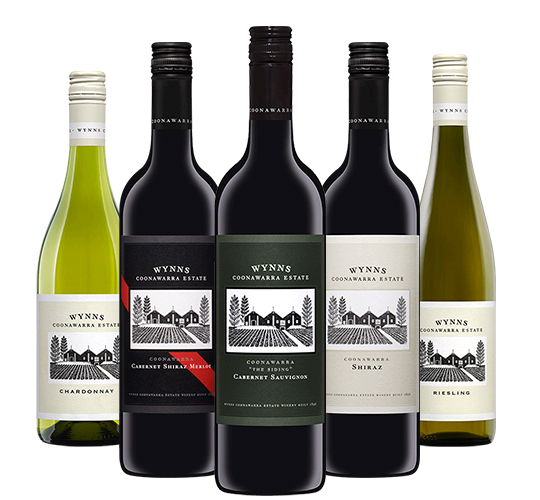
Wynns’ range continues to feature Richard Beck’s woodcut of the original winery and distillery.
So if you study the bottles from Wynn’s era through several corporate takeovers to today’s ownership by Treasury, 70 years on, you’ll be alarmed at the repetition you’d never noticed before. That woodcut stays distinctive through all manner of adjustments and tweaks, even surviving brilliantly the inclusion of a black background and a bright red stripe.
To Wynn, that map on his back label (long gone, mind you) was much more important than any attempt to describe the contents beyond those basics: owner, source, type, strength and age. He had a new region to promote – nobody had heard of Coonawarra, or knew where it was. Wynn believed that if the brand was sufficiently distinctive to earn respect, the drinker would quite simply trust the contents without having to interpret some winemaking waffle about smells and flavours and whatnot.
With all that digested, I’m not here to say winemakers shouldn’t attempt to somehow describe the style of the drink they want you to buy. Get the biro out. Have a bit of a write. Get an editor to have a go at it. Designers are not editors.
But if your wine smells a bit like lignite, I wouldn’t be bragging of that on the back. I’d leave that evaluation to the critic to discover, hoping such a thing would never occur.