

For its 2018 program, the Adelaide Symphony Orchestra has once more collaborated with designers who translate the deep sounds of the orchestra’s instruments into abstract visuals that spring from the page.
August 21, 2017
Commerce
Like music before your eyes
- 1
- 2
- 3
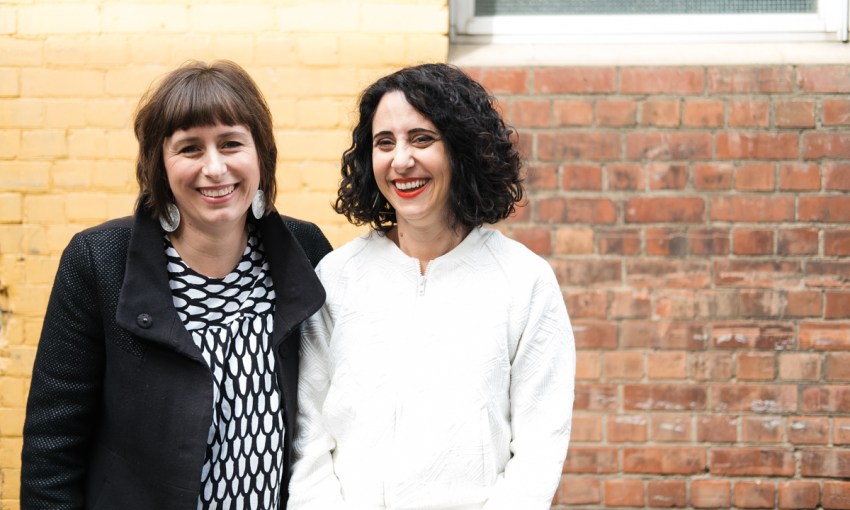
Ever since Paola Niscioli took up the role of Marketing and Development Director at the Adelaide Symphony Orchestra (ASO) about four years ago, she’s been looking for designers who can capture the ephemeral feeling of an ASO concert visually.
Remarks
The Adelaide Symphony Orchestra launches its 2018 season program on August 24.
In 2017 she found those designers.
Kelly and Anthony O’Sullivan of Influx Creative had been working sporadically with Paola for years, and had designed some single ticket campaigns for the ASO.
“We knew that Kelly and Anthony understood how to communicate such an intangible art form visually,” says Paola. “We just went to them and said, ‘well this is what we want you to do, but we’re not sure how you’re going to do it’.”
Kelly though, who has always had a deep appreciation for orchestral music, had some ideas.
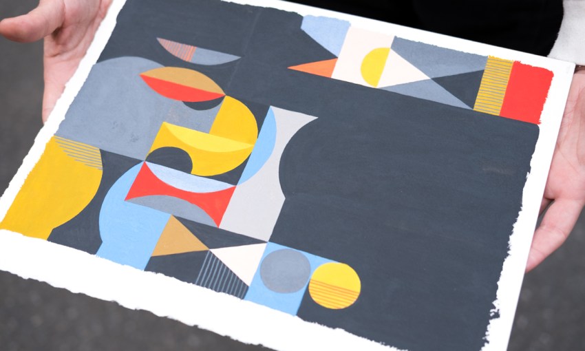
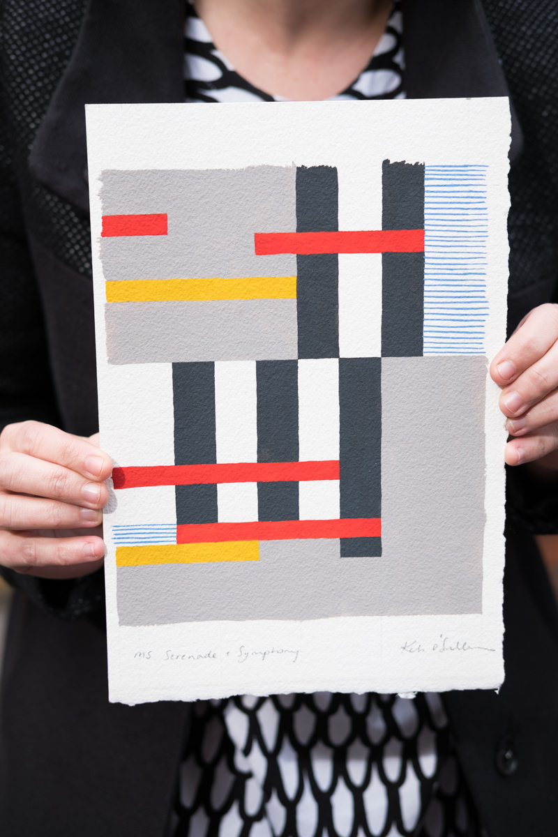
As a practicing artist as well as a graphic designer, she decided to begin visually interpreting the music and themes of each ASO concert into an artwork.
This is a huge departure from the standard form of an art organisation’s annual brochure, which would generally feature familiar faces used to promote each show.
“We weren’t sure how far to go – whether we needed to still include some of the portraits of the musicians or the conductors,” says Kelly. “We weren’t sure whether we had to have a really clear narrative or we could just evoke a feeling.”
But, when presented with a range of concepts, Paola immediately decided on the most abstract and evocative, which entirely replaced the usual visuals of each show such as photographs of soloists with an interpretive work by Kelly.
“Luckily, I have a senior management team who are all of an equal view,” says Paola.
“In other arts orgaisations people try to introduce radical design concepts and there’s resistance because, no, that’s not the way you portray an arts organisation. Whereas everyone at the ASO has really embraced the freshness of it.”
For 2018, Kelly and Anthony stuck with the key concept of the previous year, but decided to extend it.
“Last year, all of the illustrations were created digitally, but this year I painted each of them by hand so the result is a lot more textural,” says Kelly.
“My first step is to research… Paola would provide a page on what the concert is, everything about it, the pieces of music and the themes. And that straight away is where to start researching the pieces of music… That kind of leads you off onto little musings and then I start drawing and sketching and it gradually evolves.”
As an illustrator, artist, and graphic designer, Kelly is able to keep the multiple potential uses of each artwork in mind as she creates them.
She considers how they can be re-purposed for things like posters and website usage that will come after the initial launch. Meanwhile, her partner Anthony takes her artwork and builds the brochure itself – setting type and placing elements around the imagery.
In striking upon this solution, the ASO have also solved a problem currently plaguing many arts organisations attempting to revive an ailing subscriber base declining thanks to the attrition of age.
In presenting a more abstract representation of their program, the ASO is allowing new audiences to find relevance in its work without alienating the punters who have been with them all along.
“I’m one person interpreting music in one way, there are a million other ways that can be interpreted,” says Kelly.
“This is a way to help the audience get their own experience out of it,” says Paola.
And that’s what an orchestra should be all about.
Share —