Can Comic Sans be saved?
Comic Sans attracts an unusual level of rancour in the workplace.
A new font called Comic Neue, by Sydney-born designer Craig Rozynski, has been trending online in the past few weeks. The font was developed, in the designer’s words, “to save Comic Sans”, one of the most famous and criticised fonts ever.
It took three years for Rozynski to develop the font. But was it worth the effort? And does it save Comic Sans, as it was intended to?
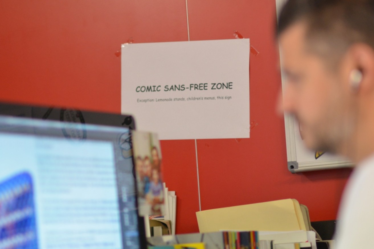
Using Comic Sans is on the big-type-crime list of any designer. Plans are being forged to end its world dominance at The Ban Comic Sans group. In the Comic Sans Must Die project, every day one individual glyph of Comic Sans was symbolically “destroyed” online in a short animation, for all to see.
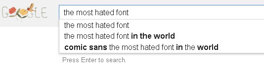
Even Google makes it very clear what “the most hated font” is:
 How does a font become so hated?
Microsoft released the original font in 1994.
Its American creator Vincent Connare objected to a serious and formal font, Times New Roman, used in a test version of “Microsoft Bob”, so designed Comic Sans to replace it in the speech bubbles of Bob’s cartoon characters.
Connare never intended for the font to be used in any other way. Slowly though, Comic Sans made its way to everywhere text was used – door signage, exam papers, medical information, official letters and so on.
Fonts have a huge impact on setting the tone and mood of printed or displayed messages, made clear here on The Conversation by design academic Louise McWhinnie. The term “visual language” refers to those meanings created by the appearance of text and image, meanings that enhance the text’s literal meaning.
There are fonts that can convey professionalism or seriousness, but Comic Sans is not one of them.
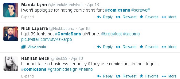
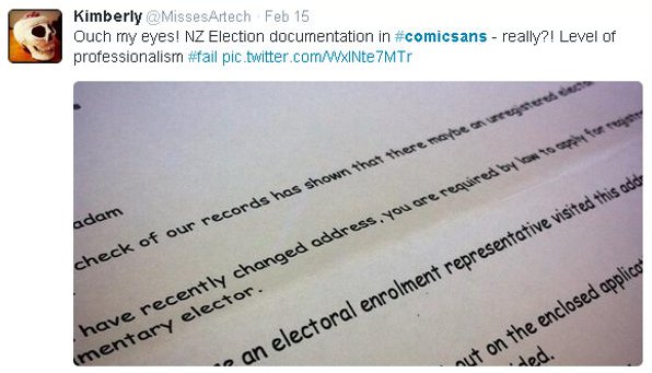
Tweeps unload on Comic Sans
Comic Sans is the funny, friendly, cute, cheer-up, informal, good-for-a-child’s-birthday-party-invite font.
When so widely used outside this context – in the announcement of the Higgs Boson particle discovery, say, or Pope Benedict’s resignation letter in the Vatican’s online photo album – the mismatch between the literal meaning of a text’s message and the font’s added meaning of infantility and fun creates a new meaning of immaturity, unprofessionalism, or pretentiousness.
This misuse in wrong contexts, together with the font’s ubiquity enlarging the scale of the problem, is probably the main reason behind the worldwide hatred.
Twitter.com
A verdict on Comic Neue
How has the worldwide misuse, especially by non-designers, been addressed in the new release of Comic Neue? It seems it hasn’t. According to the Comic Neue website, it was the weirdness of Comic Sans that Comic Neue tries to fix; its “squashed, wonky, and weird glyphs”. This has been achieved.
Comic Sans was drawn up to imitate the style of hand-lettered comics. Each letter was conceived individually. Unlike in many other fonts, the horizontal strokes in the uppercase “E” are different to their equivalents in the uppercase “F”; lowercase “p” and “d” are not just the same forms rotated 180 degrees.
Lines are crooked, and angles of vertical strokes vary greatly – the lowercase “g” leans to the right compared to the lowercase “j” which leans to the left – as you would expect from a child’s handwriting. None of this is true in Comic Neue.
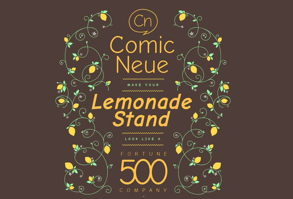
comicneue.com
The unified appearance and clearness of the font is based on repeating familiar established forms. The look and feel of Comic Sans is like that of a rough and cute (childlike) handwritten typeface. Comic Neue is the corporate version of handwriting: efficient and uniform. Comic Neue also seems more legible, mainly because of bigger “counters” (the empty bit in “p”, for instance).
The quirkiness of Comic Sans is gone, but what does that actually leave us with? Comic Neue, according to its website, is meant as:
..the casual script choice for everyone … perfect as a display face, for marking up comments, and writing passive aggressive office memos.
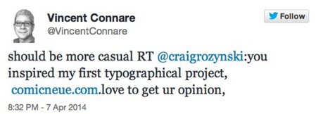
Is it still meant to look like handwriting? Is it a child’s handwriting, or maybe that of an office worker? Is it still meant to convey fun and playfulness, or is it serious? Is it “the casual script choice” or not? Connare gave some feedback on Twitter:
twitter.com
The website’s cheeky message, “make your lemonade stand look like a Fortune 500 company”, which conveys aspiring professionalism, does not help to clarify. What does the font make the lemonade stand look like?
Comic Neue tries to “save” Comic Sans by creating a different font, getting rid of the “essence” of Comic Sans. The new font may not get misused but with its childlike quality gone, will people have a reason to use it at all?
Rather than create a new font, why not just rename the old one “Children’s Party”? I can’t see the Pope formatting his communication with that.
Gerhard Bachfischer is course director/lecturer of Visual Communication at the School of Design at the University of Technology Sydney. This article was first published on The Conversation.