Message on a bottle: SA’s tastiest wine labels
There’s so much more to a bottle label than the basics – producer, variety and vintage. It’s time to take notice of South Australia’s design community for their internationally recognised role in our wine industry.

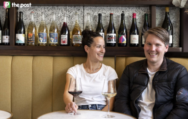
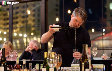
Some of the design work featured in the Message on a Bottle exhibition. Supplied image
Picture this.
You’re in your favourite bottle shop scanning the shelves for a wine to take to dinner. You don’t have any pre-set, go-to bottles on your radar. Price is not the major issue.
It’s down to the label that grabs your attention most of all.
You might be convinced by a traditional style and the trust it conveys simply via the producer’s name and region. Or you might be sold on the novelty of virtual reality, scanning a code and label illustration to unveil a clever video story via your phone.
Right at this point, a wine label is the most powerful key to you making a purchase. What you might not take into account is that this very label, the one that’s going to turn the switch for you, may have taken a graphic designer or an illustrator, or in fact a whole team of designers, a year to produce.
It holds within it many messages, from symbolising the culture and history of the family behind the winery name, to the old-world tradition of the grape variety.
It might be a small but beautiful work of art in its own right. Or it may encompass an exciting technological breakthrough. Or both.
What we don’t usually consider, however, is that wine labels are the living, breathing evidence of a creative stream of designers and design studios here in South Australia that has lifted the state to international prominence in the field.
The power and importance of that wine label are often bypassed on the way to the sensory pleasures associated with the product inside the packaging.
Which is exactly why the “Message On A Bottle” exhibition, opening today at the Bob Hawke Prime Ministerial Center and UniSA in the Kerry Packer Civic Gallery (September 1-29), has come about.
Conceived by the late Rita Siow, an influential educator and industry advocate for the design community in South Australia, and general manager of the Australian Graphic Design Association, the exhibition celebrates the important contribution wine label design and designers have made in the establishment and growth of the wine industry in SA and nationally.
Exhibition co-convenor David Blaiklock, program director of the Bachelor of Illustration and Animation course at UniSA, emphasises also that not only has the design community in South Australia been a vital cog in the rise of the local wine industry, but its work has become synonymous with how we are perceived internationally.
“It’s really been under-sung,” Blaiklock says.
“This is what Rita Siow was always talking about: we don’t really celebrate design and designers and their contribution to every industry, and particularly in the wine industry.
“It’s really significant in South Australia.”
The late Rita Siow (left) with students. Supplied image
The creative output from here has been enormous, Blaiklock says, starting with the legendary Wytt Moro, followed by a generation that included the likes of John Nowland, Ian Kidd, Barrie Tucker and Karen Seja.
“They were the leaders, and had a critical impact on design practice and education in SA,” he says.
“And from there we now have many unbelievable designers when it comes to the world stage – the likes of Parallax, Voice, Mash come to mind, and many more.
“These designs leaders are in fact international practitioners recognised around the world. As is the wine. The two sit together.
“That’s what we are celebrating.”
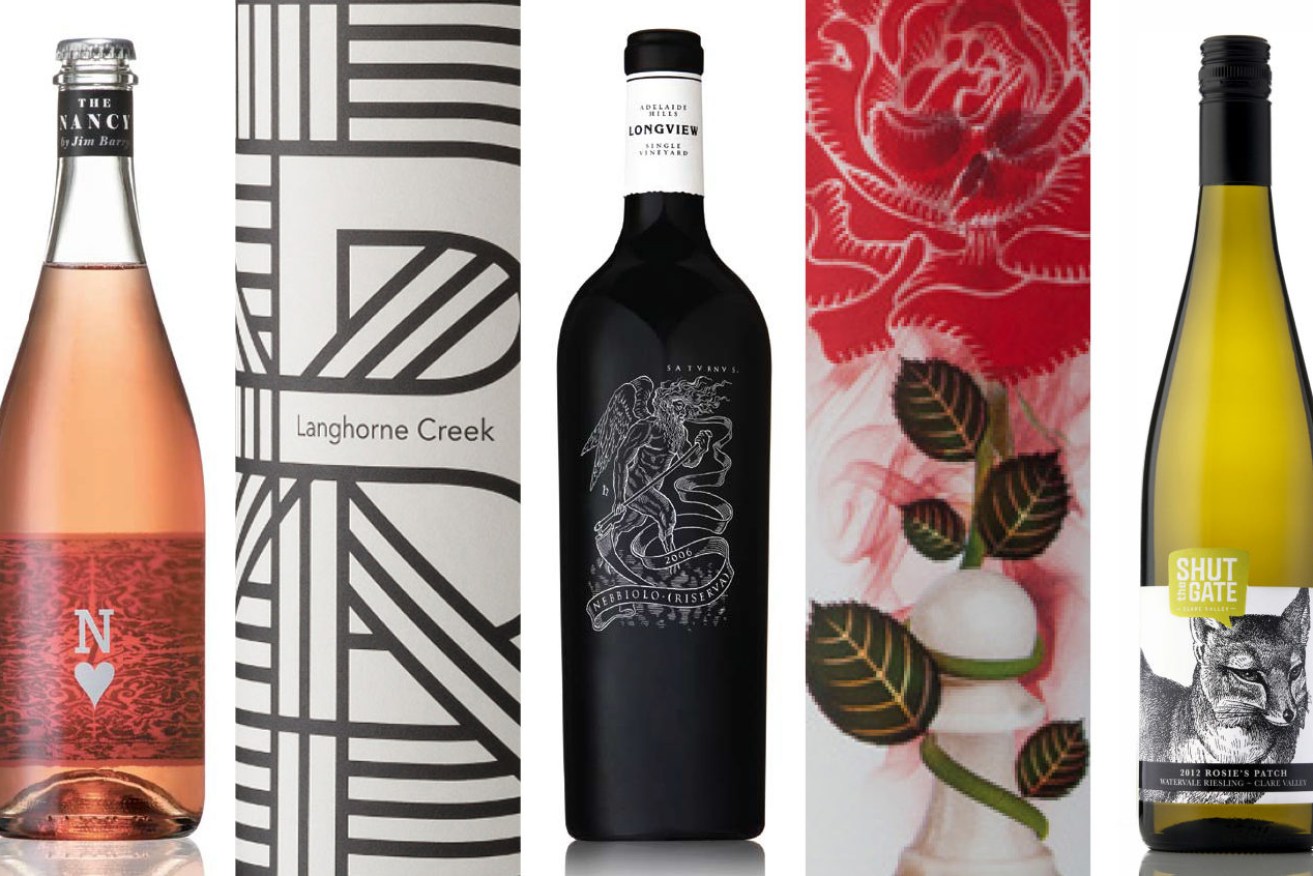
The exhibition showcases 70 years of wine label design featuring 150 examples presented by 15 leading SA design studios. The brands include names such as Penfolds, Yalumba, Wolf Blass, Petaluma, d’Arenberg, Hither&Yon and Alpha Box & Dice.
Telling their stories via a tiny space on a bottle is difficult to explain, says Voice Design Studio co-founder and creative director Scott Carslake.
“It can be extremely romantic, it can be tactile, but ultimately it’s about communicating to the consumer what that brand represents or what the product is about, and then tell that story,” Carslake explains.
“It’s about the personnel, the product, their personalities, their purpose – all those values inside the brand. The role of the designer is to take that and transfer it onto a wine bottle to communicate the authenticity of the brand.”
The skill lies in getting it down to a single-minded proposition, he says.
The link between the creative and commercial sides of the wine industry, when it comes to elements like a wine label, is where Rita Siow came into her own, bringing businesses together, linking up with the city’s educational institutions like UniSA and TAFE, encouraging creative practice and innovation and eventually being an inspiration to the entire design community here and nationally.
Her unexpected death in December 2020, while developing the exhibition, was a shock that still reverberates within the design industry.
“We had a great connection with Rita,” Scott recalls. “She was a huge supporter of ours, and an industry advocate for us.
“She’d come to us and see what we were doing, she’d ask us to speak and present to the design industry and students. She was just a massive influence in the national design community.”
The exhibition will include a tribute to her role in encouraging and developing Adelaide to be a leader internationally in the design field.
David Blaiklock stresses however that she was adamant not to be the focus of the show. She never wanted it to be about her, but more importantly about the incredible impact designers have had on our larger lives.
“We have had a massive influence on this industry especially,” he says. “It contributes to the cultural structure of the state, from a creative perspective and from a social perspective.
“Yet, it’s taken for granted.
“Art and design form the fabric of our lives. They are the visual language we navigate when we go places, when we talk about so many aspects of how we live.
“When we visualise wine, we don’t visualise it as red wine – we visualise the label, the logo, the finish, how it looks on the table.
“All of those things are part of our culture, our social experience, and a graphic designer is responsible for all of that.”
Message On A Bottle: 50 Years of South Australian Wine Label Design, is showing at the Bob Hawke Prime Ministerial Center and UniSA in the Kerry Packer Civic Gallery (September 1-29). Exhibition conveners: Marchelle Matthew, Doreen Donovan, Lynda Kay and David Blaiklock.
Design notes: By Scott Carslake, Voice Design Studio
d’Arenberg The Old Bloke and the Three Young Blondes
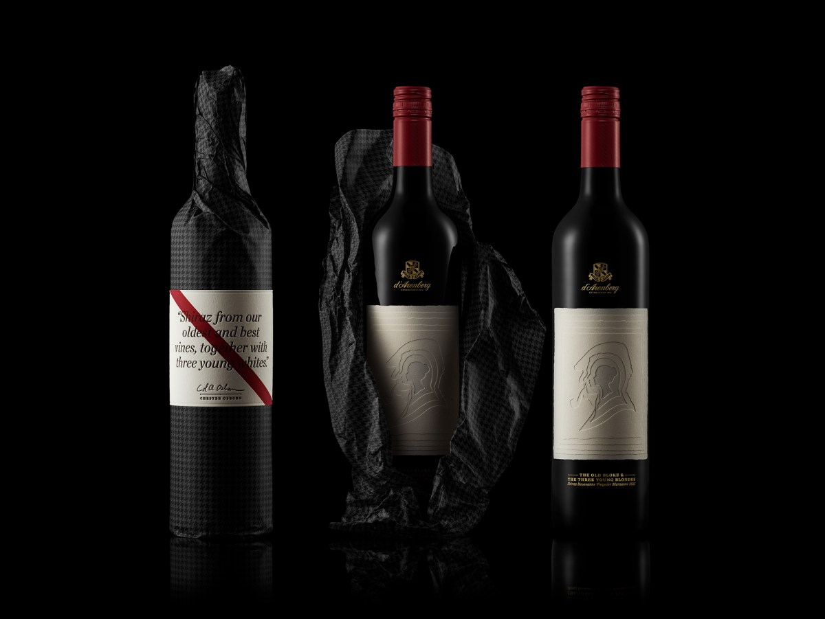
Named for the old Shiraz vine and three ‘young’ white varietals from which the wine was made. Each of the characters is represented as a die-cut silhouette on an individual paper label. Much like the wine itself, the four personalities are ‘blended’ together by being overlaid one on top of the other, each creating a window to the next and achieving an effect of tactility and depth.
The finished package is presented in a paper wrap (the houndstooth pattern a nod to the Old Bloke’s flat-cap) and a unique letterpress label featuring the story behind the wine and d’Arenberg’s iconic red stripe.
Hugh Hamilton ‘The Oddball’ Saperavi
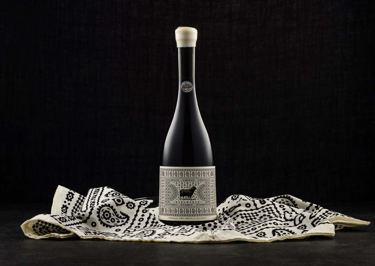
In Georgia, it’s an ancient tradition (known as ‘Supra’) to celebrate wine and food with good company. At these feasts, tables are dressed with ‘Lurji Supra’ – tablecloths adorned with ornaments and symbols depicting elements of Georgian culture and custom. To ensure the Australian market knew these wines were truly exotic – Saperavi is a Georgian variety – illustrations honouring the traditional ‘Lurji Supra’ were created. These textiles often featured a large ornament or symbol in the centre. In this case, the brand mark of Hugh Hamilton (the ‘black’ sheep) became the centrepiece.
Sevenhill
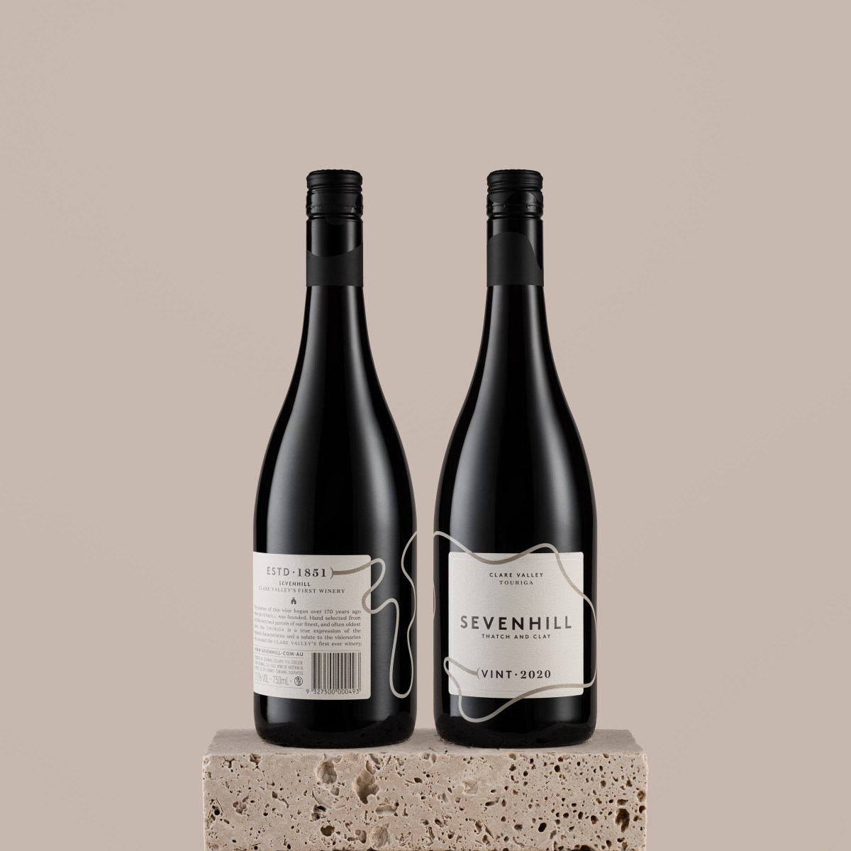
The journey of each Sevenhill wine began over 170 years ago when Sevenhill was founded. Each bottle features a journey line that takes the consumer all the way back to 1851, then brings them back to the present moment, to the vintage they are holding in their hand.